For the bicentenary of Mary Shelley’s Frankenstein, the Harvard Theatre Collection mounted an exhibition tracing how the mute and dumbstruck monster became the grunting green giant of screen and stage that we know today. I executed the storybook-style exhibition labels based on copy and assets supplied to me by the curator (Dale Stinchcomb) and the publicity campaign with the above design concept. Inspired by T.P. Cook's original illustration, I redrew the monster, wringing lurid melodrama from a cooler color story. The image was adapted to various formats and dimensions, including campus and exhibition signage, optimized social media email blasts, as well as an iPad kiosk, where members of the Harvard community could sign up to read passages from the novel on Halloween during the international observance of Frankenweek.
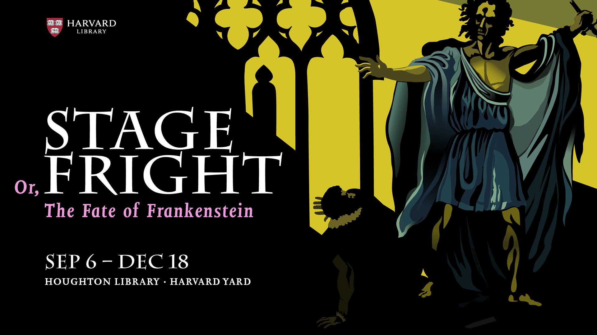
Above: FrankenTwitter and Frankenfacebook
Dark Mode
Lighting is suboptimal in the Houghton Library basement, where the curator and I decided to mount the Halloween-themed exhibition. Colors appearing a certain way above ground appeared entirely different below ground. Multiple color tests led to the frustrating production of "Frankenlabels" before I was able to find a tone-on-tone color combination that read well in both circumstances. The glowing green color combination used for exhibition labels was inverted for use in the banner illustrations reproduced at the end of this case study.
Case Study: Before & After
Deliverables
Inspired by T.P. Cooke's original illustration of Frankenstein's monster.
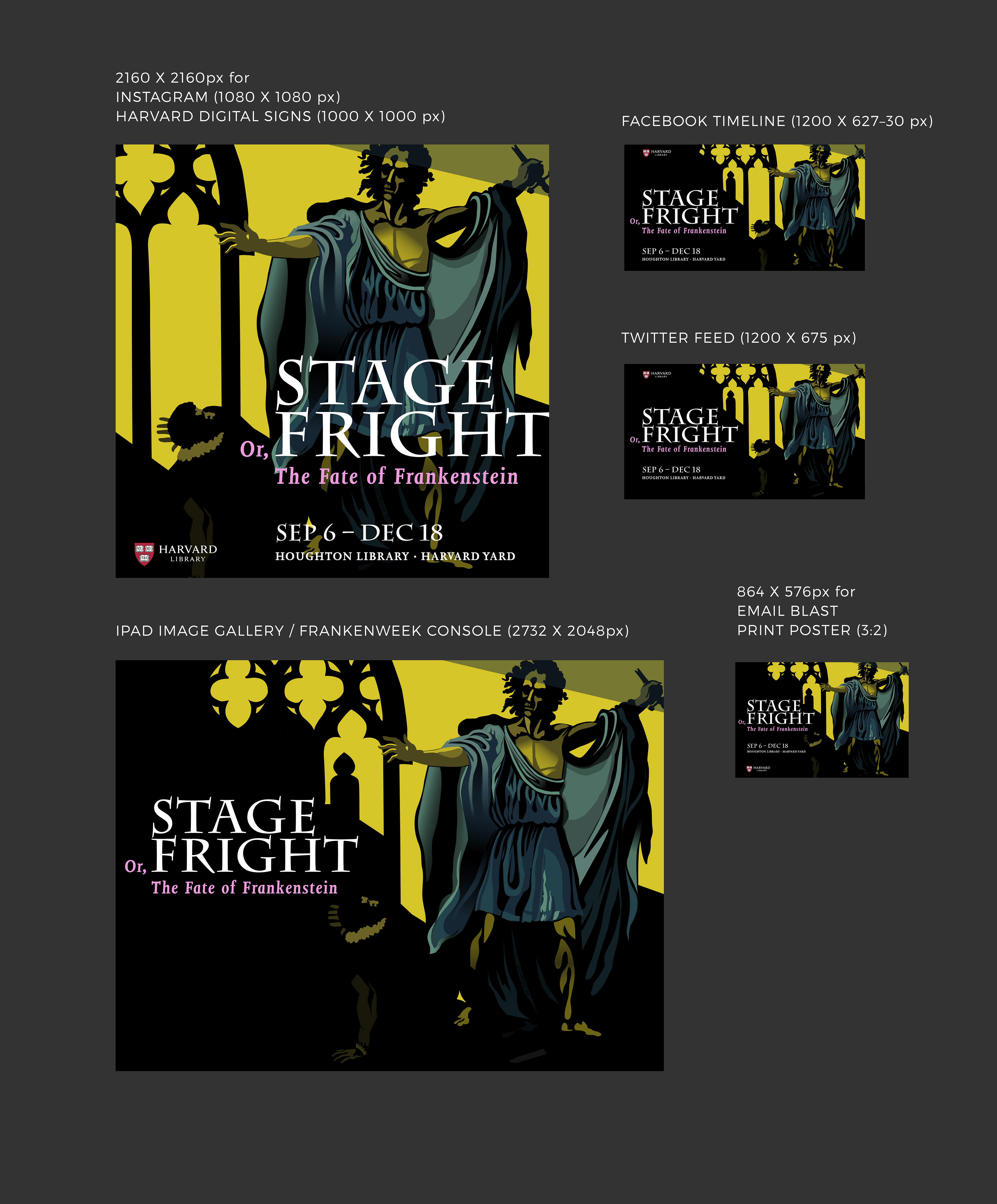

Social media optimization for Instagram, Facebook, etc.
