Client and Brief
Houghton Library is the chief repository of rare collections at Harvard University. Located in the southeast corner of the Yard, the library draws an international community of researchers, hosts numerous classes and programs, and mounts quarterly exhibitions based on its extensive archive of original manuscript material, historical photography, visual art, performing arts ephemera, and more.
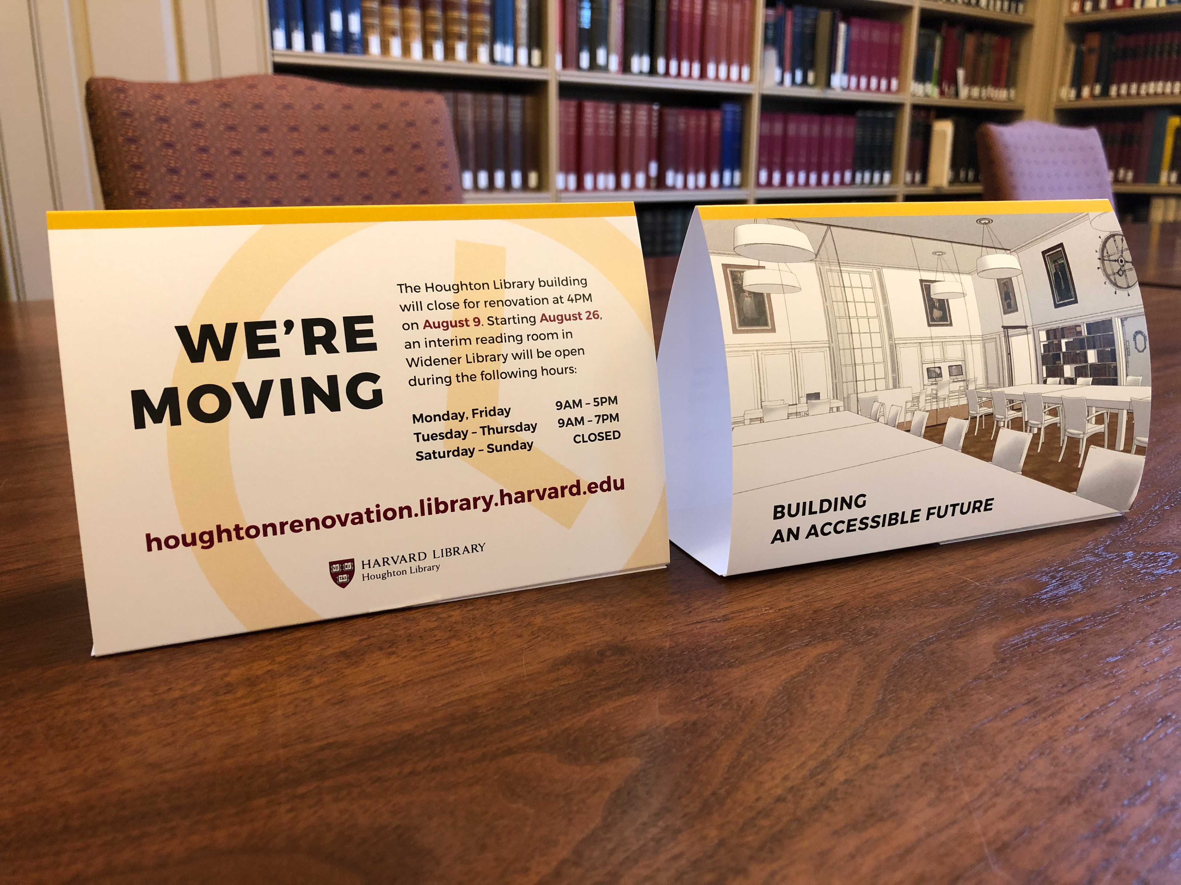
With a renovation project underway, Houghton hopes to address charges of being inaccessible, while spelling out the value it provides to patrons in four key areas: Teaching, Research, Collections, and Programs/Exhibitions. This construction site scrim aims to do both, announcing Houghton's makeover from formidable gatekeeper to friendly giant, with world-class collections, wheelchair accessible ramps, a diverse staff, and imaginative programming that caters to a broader public.
Building a Scrim, vs. Building a Wall
The three printable areas of the construction scrim face different landmarks. From Lamont Library, undergraduates will have a panoramic view of the scrim from the indoor cafe; as will faculty and administrators from Loeb House. Tourists walking along the NW to SE hypotenuse of Harvard Yard are expected to take snapshots. The dream scrim for the job, as I imagined it, would meet the accountability standards of a younger 'woke' generation, remain respectful of the Harvard tradition and brand, and address itself to an international audience through its imagery.
Extending the Brand
As a visual identity, the Harvard Libraries system employs a primary color palette, anchored by the university's signature Crimson, with bold blue and yellow accents to highlight services, emphasize calls to action, and define gradients. The overall color scheme was chosen to reflect the "fresh energy of the library, as the traditional and the modern work together." Affable-looking open-source typefaces echo the website's claim to make "tools and resources accessible to all." The primary typeface is Trueno, a "fork" of Montserrat that comes with true italics. Its piggy touch (curly tails and large x-height) makes it more legible and less formal than other geometric sans type like Futura. Sharing its large x-height, the secondary typeface Lora retains Harvard's connection to print and the humanities. Incidentally, it is the same body type used on the City of Boston website, whose primary typeface is Montserrat.
Assets to Assets, We All Rise Up
Some 30 images had been supplied to me by a diverse committee of curators and administrators eager to accommodate a rainbow of identities and interests. 17 appear in the grid below. Not every image made the final cut of 19. The challenge before me was to organize the collective maelstrom of desiderata around a cohesive design concept that also met Harvard Libraries' revamped branding guidelines.
Mockups: Early and Final
The three scrim were prepared at reduced scale (1 in = 1 ft) with intensified resolution (600 ppi). With 30 images to choose from, a 3-in-1 mockup became a tall order. By creating vector silhouettes of the rasters, I could experiment with different configurations and buy more time for photo-manipulation and compositing images, when the type and layout were up for review.
In lieu of plain white ground, I opted for panels in alternating colors. I dialed down bookmark blue to avoid comparisons to a certain flag and to achieve greater value contrast with crimson. In addition to bookmarking Houghton's four major services, brilliant yellow provided me with a means for tying together non-adjacent scrim. Where possible, I coaxed out hues from the given assets that complemented the brand colors. When the committee had a change of heart concerning the necessity of captions (in Lora), I maximized Trueno's many weights to clarify hierarchy.
From the first pass, it became clear that grey made things too heavy, that both blues competed with crimson when used as background, and that the lengthy captions pulled too much focus from the images. The committee course-corrected by paring down the descriptive copy and I suggested that we relocate the captions to the blog accessible by QR code, as shown below. In this way, the curious could find out more about the images, if they so wished, and the unbothered could go their merry way.
The final configuration of nineteen images dramatizes the equivalent of a Copernican Revolution underway at Houghton, loosening the gravitational pull of Europe in determining the priorities of teaching, research, collecting, and programs. Panels show subjects reckoning with imperialism, token trailblazers carrying the torch for underrepresented minorities, and project unforeseen horizons and iconographic serendipities across cultures, gestures, and media.
Building visual interest into the scrim meant hinting from a distance with rotated headings, maxing out a limited color palette, and exploiting horizontal and vertical reading patterns across the expansive surface through different typographic scales and rhythms.
Closeups of Final Scrim
Though the availability of certain collections prevent us from accommodating every possibly community, the final scrim addresses different aspects of the black diaspora, queer and feminist writers and photographers, trailblazing actors of color, a Native American autobiographer, representations of Asian and Asian American culture, Eastern and Western religious texts, in addition to Blake and Shakespeare. Changing demographics and research trends will invariably shape what Houghton curators collect in the accessible future.
Many thanks go to the fine people at BlueEdge, who printed the scrim and the Consigli construction firm of Boston, who will install it. Most of all, I am grateful to Anne-Marie Eze and Dale Stinchcomb at Houghton and the Harvard Libraries committee, who put their faith in me for this bold and progressive statement piece.