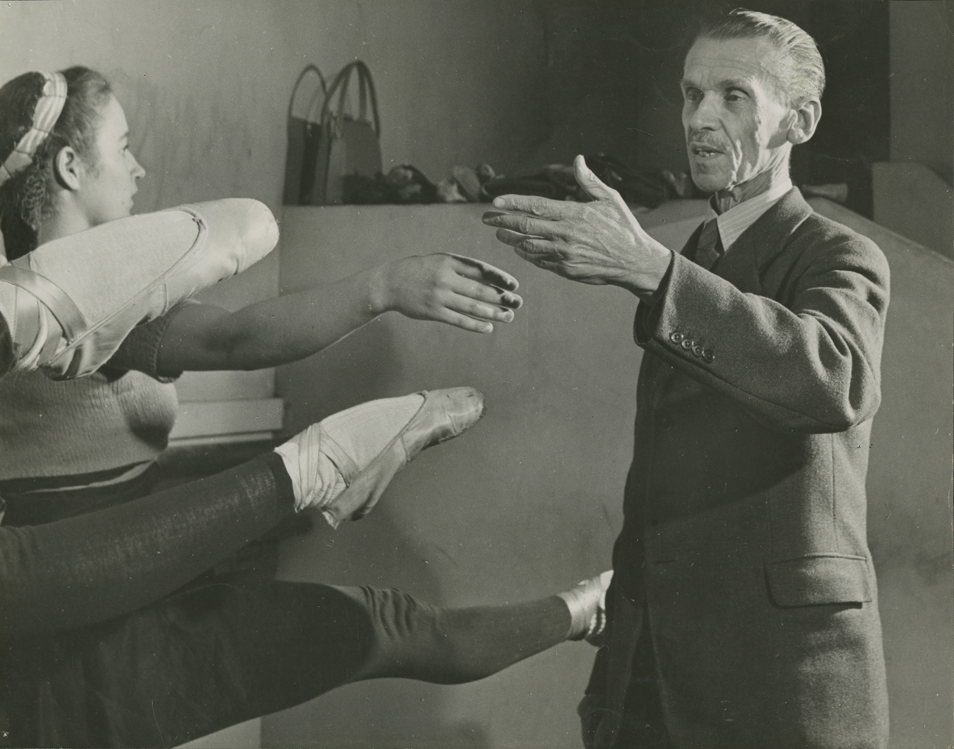
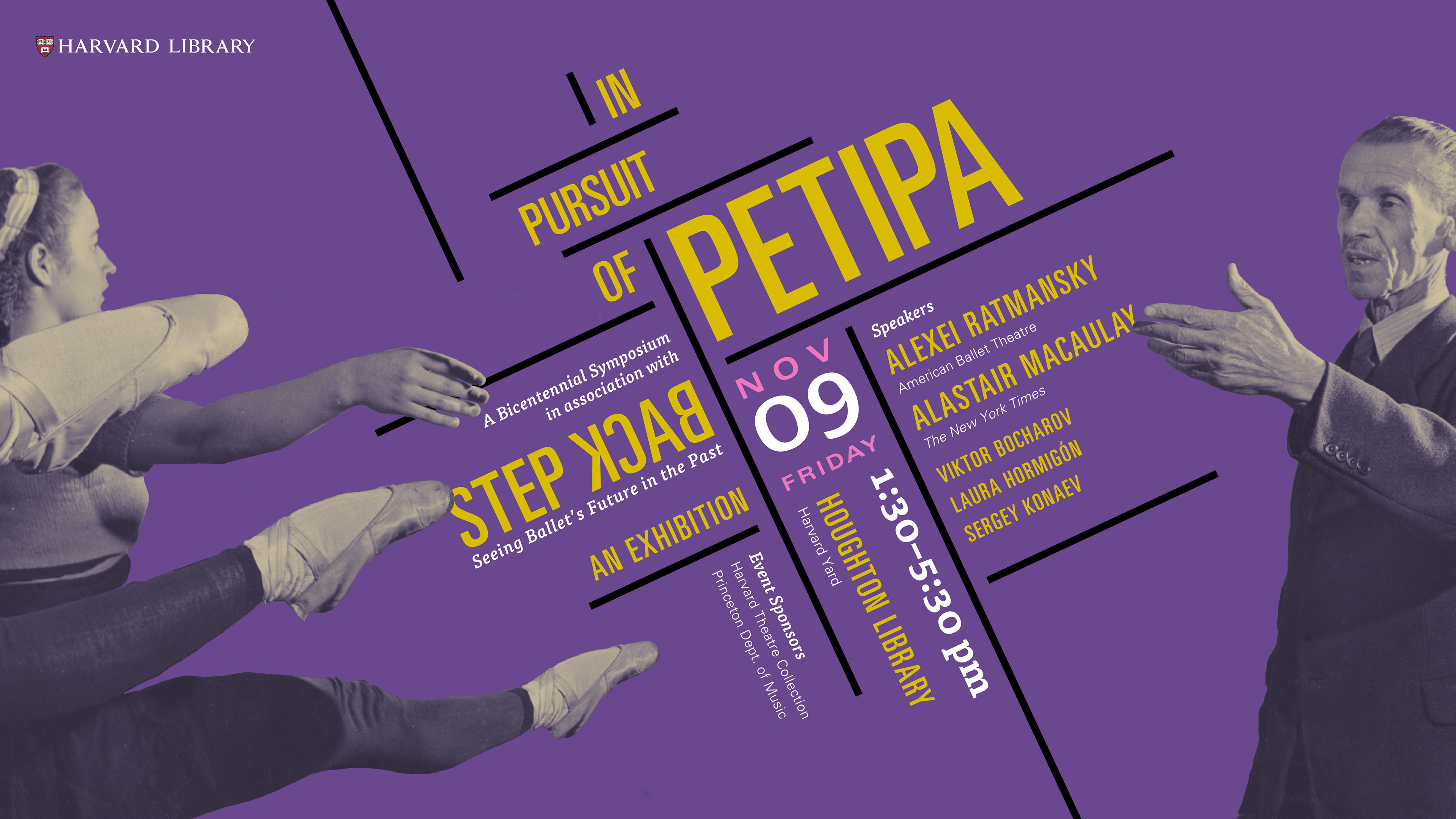
Image courtesy of Houghton Library. I based the grid on the matrix of arms and legs in a scrapbook photograph of the donor. Elements of the banner image could be re-cropped or re-spaced for various dimensions, yielding everything between a leg show and The Creation of Madam.
Dancers pursuing perfection inspire the Constructivist design concept that disciplines the dreamy palette of the classical ballet.
Step Back and In Pursuit of Petipa exemplify how exhibitions tend to generate a constellation of events including lectures, readings, and concerts, for which promotional material and event collateral must be designed as related modules.
The bicentennial exhibition and symposium explored the legend of French-born choreographer Marius Petipa and the efforts of his Russian disciples to preserve the endangered art of ballet through the invention of dance notation. Highlighting the Nicholas Sergeyev collection of rare objects and documents rescued from the Russian Revolution, the exhibition provided the occasion for an international panel of dance luminaries to congregate and share with the public how it is a younger generation of choreographers have reconstructed Petipa ballets from La Bayadere to Swan Lake in the speculative image of their former glory.
Studies for a Stairwell
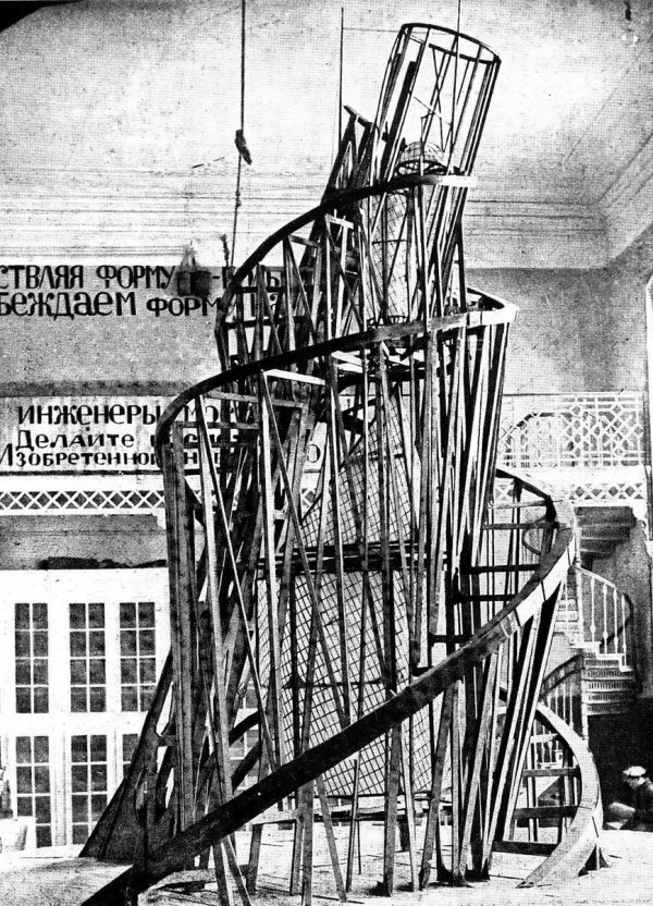
Visitors' eyes and feet were drawn to the upstair exhibition gallery by means of vinyl decals displaying a reverse chronological timeline for 14 Petipa ballets spanning two flights of the winding stair in the Houghton Library lobby. I was inspired by the Tatlin photograph of the Third International as well as a SoFi ad that I saw in the South Station terminal of the Boston MBTA. After measuring individual stair widths, I created the bespoke decals for sign makers who would print and install them.
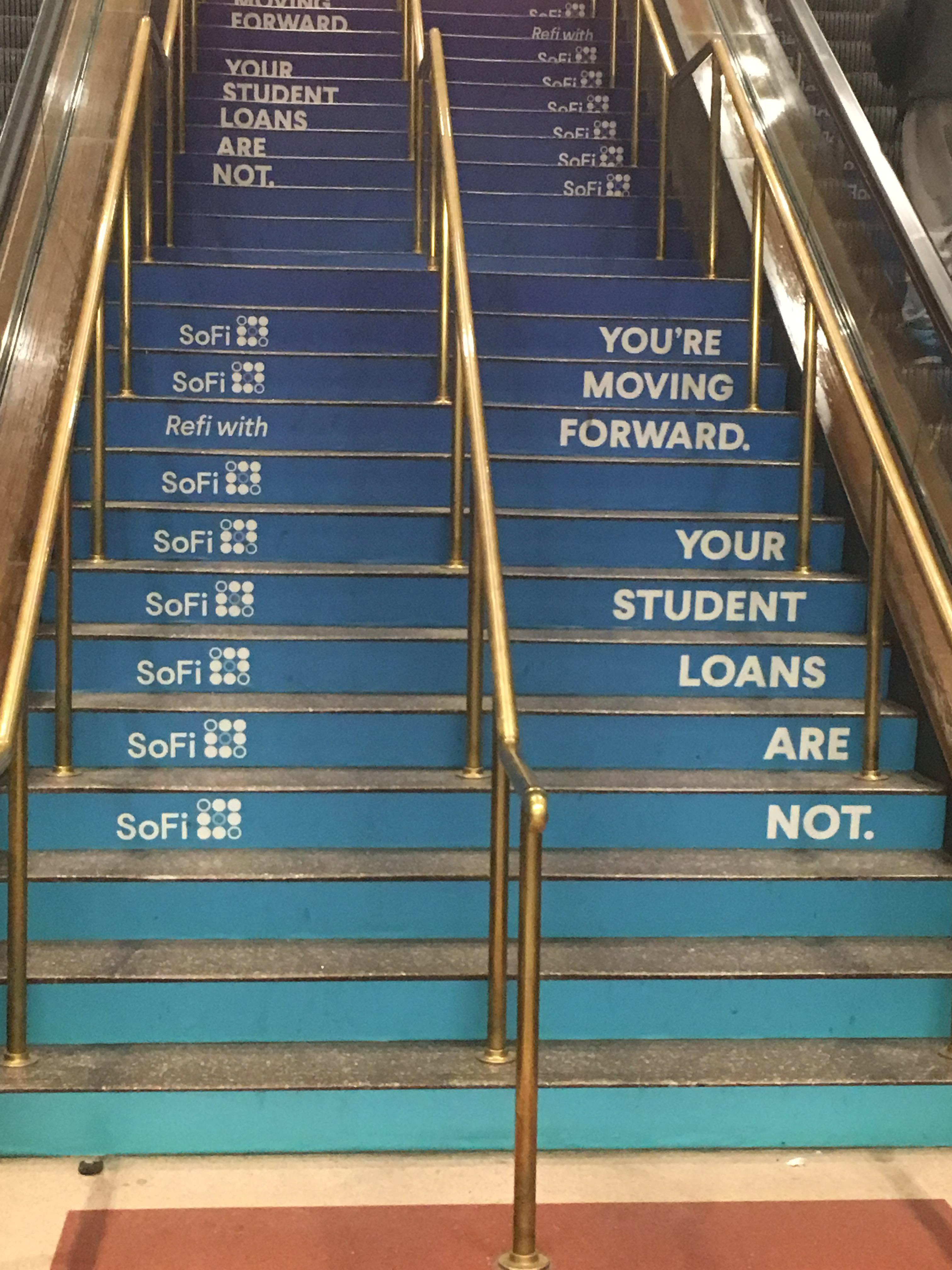
Stair decals in the Bus Terminal of South Station, 2018


The results of the stair treatment dictated the aesthetic identity for the exhibition as a whole since the job called for condensed caps with no ascenders or descenders to achieve sweeping parallel lines. The squat Q of Univers Condensed allowed me to minimize margins and maximize cap area in every case including PA(Q)UITA and HARLE(Q)UINADE. Paired with FF Tisa, the modernist sobriety of Univers struck a nice contrast with the sallow walls and the wrought-iron filigree of the banister. I presented a number of color options, but persuaded the curators about the complementary virtues of eggplant because of the large number of gold or yellow-tinged exhibition objects (It was a hard sell). The winding stair was further emphasized by the placement of the first vitrine at the foot of the stairs as the exhibition teaser.
Cases and Labels (and Grid)
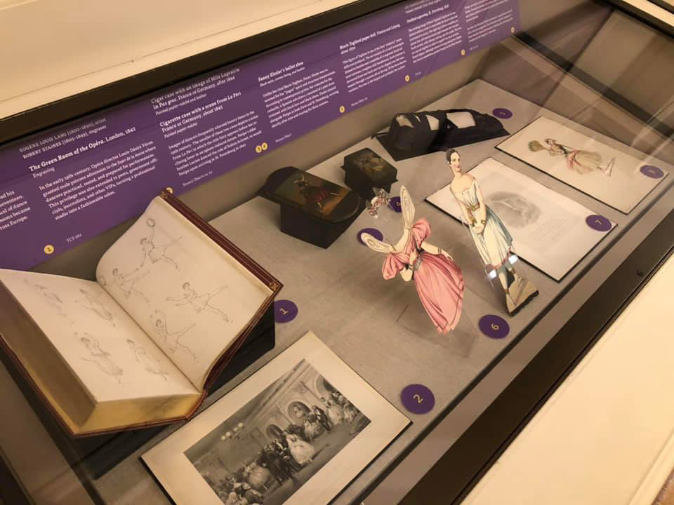
Sample case shown; below, revised InDesign file with baseline grid and improved spacing and tracking.
Symposium and Souvenir Booklet

Alastair Macaulay twirls during his keynote, "Why does Petipa matter today?"
Photo of symposium participants and organizers.
